Using TabLayout from the Design Support Library -- the least you need to know.
This post presents a simple example of using TabLayout from the Android Design Support Library.
It’s the second part in a series about implementing tabs on Android without using any APIs deprecated in API level 21. In the previous post I looked at PagerTabStrip, which works well enough. However, TabLayout provides a look and feel more in keeping with Material Design conventions. In this post we’ll convert the example from the previous post to use TabLayout instead of PagerTabStrip.
The first thing we need to do is include the Design Support Library in the dependencies of the app’s build.gradle file:
compile 'com.android.support:design:22.2.0'
In the activity layout (activity_tab_layout.xml) we place a TabLayout widget and a ViewPager:
<LinearLayout xmlns:android="http://schemas.android.com/apk/res/android"
    xmlns:app="http://schemas.android.com/apk/res-auto"
    android:orientation="vertical" android:padding="4dip"
    android:gravity="center_horizontal"
    android:layout_width="match_parent" android:layout_height="match_parent">

    <android.support.design.widget.TabLayout
        android:id="@+id/tabs"
        android:layout_width="match_parent"
        android:layout_height="wrap_content"
        app:tabMode="fixed"
        app:tabGravity="fill" />

    <android.support.v4.view.ViewPager xmlns:android="http://schemas.android.com/apk/res/android"
        xmlns:tools="http://schemas.android.com/tools"
        android:id="@+id/pager"
        android:layout_width="match_parent"
        android:layout_height="match_parent"
        tools:context="net.voidynullness.android.tabitytabs.TabLayoutActivity">

    </android.support.v4.view.ViewPager>

</LinearLayout>
There’s a number of useful attributes for TabLayout.
Above, we set tabMode to fixed to show all tabs. The other alternative is scrollable, where the tabs can be scrolled (similar to PagerTabStrip).
tabGravity determines alignment of tabs. It can be set to fill to space out tabs to fill available space, or centre to cluster the tabs in the middle of the TabLayout.
If we wanted to we could programmatically add tabs using the addTab() and setText() methods:
tabLayout = (TabLayout) findViewById(R.id.tabs);
tabLayout.addTab(tabLayout.newTab().setText("Tab 1"));
tabLayout.addTab(tabLayout.newTab().setText("Tab 2"));
tabLayout.addTab(tabLayout.newTab().setText("Tab 3"));
But we’re not going to do things that way for this example.
Instead, we will create a hosting activity (that subclasses AppCompatActivity) which will use the above layout, and wire up the ViewPager to the TabLayout. The ViewPager will take care of fragment switching for us (TabLayoutActivity.java):
package net.voidynullness.android.tabitytabs;

import android.os.Bundle;
import android.support.design.widget.TabLayout;
import android.support.v4.view.ViewPager;
import android.support.v7.app.AppCompatActivity;


public class TabLayoutActivity extends AppCompatActivity {

    @Override
    protected void onCreate(Bundle savedInstanceState) {
        super.onCreate(savedInstanceState);
        setContentView(R.layout.activity_tab_layout);

        TabLayout tabs = (TabLayout) findViewById(R.id.tabs);
        ViewPager pager = (ViewPager) findViewById(R.id.pager);
        TabsPagerAdapter adapter = new TabsPagerAdapter(getSupportFragmentManager());

        pager.setAdapter(adapter);
        tabs.setupWithViewPager(pager);
    }
}
No changes are required to our FragmentPagerAdapter (TabsPagerAdapter) or sample fragment class (PageFragment) from the previous post, so we can reuse those without changes. (See the previous post for details and implementation of these two classes).
The above activity’s onCreate() instantiates a new TabsPagerAdapter, which is our subclass of FragmentPagerAdapter, and passes it to the ViewPager, which handles most of the work of switching between tabs and fragments. To configure the TabLayout we just need to call setupWithViewPager() and pass in the ViewPager we just configured. setupWithViewPager() is a convenience method that sets things up for the common use case of letting a PagerAdapter configure the tabs. (The PagerAdapter in this case being TabsPagerAdapter.)
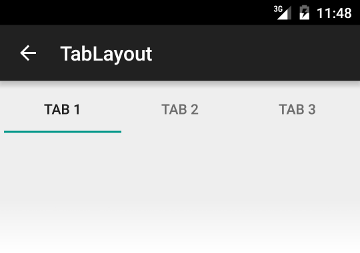
The result is a tabbed layout with a reasonably Material Design compliant look:

Comments